-
Block: Image
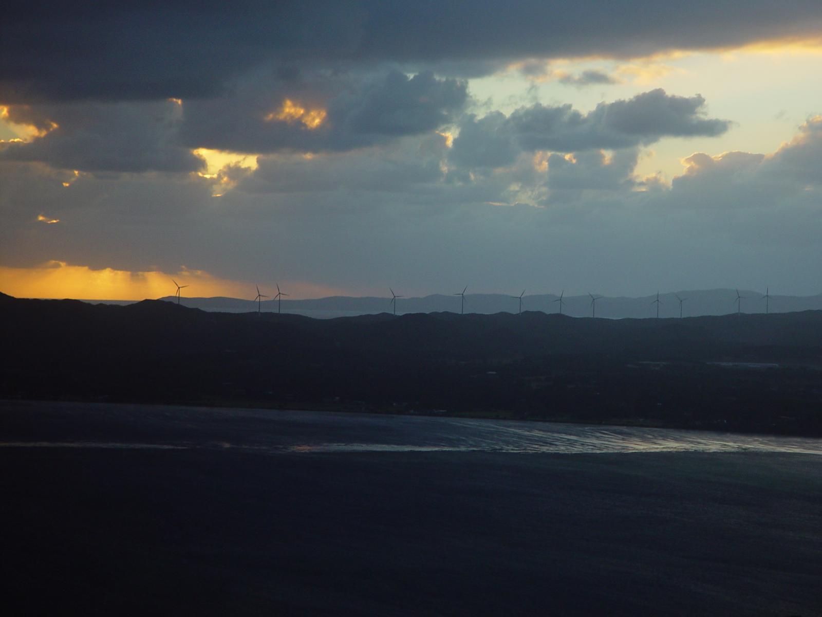
Welcome to image alignment! If you recognize this post, it is because these are blocks that have been converted from the classic Markup: Image Alignment post. The best way to demonstrate the ebb and flow of the various image positioning options is to nestle them snuggly among an ocean of words. Grab a paddle and let’s get started. Be sure to try it in RTL mode. Left should stay left and right should stay right for both reading directions. On the topic of alignment, it should be noted that users can choose from the options of None, Left, Right, and Center. If the theme has added support for align wide, images…
-
Block: Button
Button blocks are not semantically buttons, but links inside a styled div. If you do not add a link, a link tag without an anchor will be used. Check to make sure that the text wraps correctly when the button has more than one line of text, and when it is extra long. Buttons have three styles: If the theme has a custom color palette, test that background color and text color settings work correctly. Now lets test how buttons display together with large texts. Lorem ipsum dolor sit amet, consectetuer adipiscing elit. Donec mollis. Quisque convallis libero in sapien pharetra tincidunt. Aliquam elit ante, malesuada id, tempor eu, gravida…
-
Block: Cover
The cover block lets you add text on top of images or videos. This blocktype has several alignment options, and you can also align or center the text inside the block. The background image can be fixed and you can change its opacity and add an overlay color. Make sure that the text wraps correctly over the image, and that text markup and alignments are working. The next image should have a pink overlay color, the text should be bold and aligned to the left: Make sure that all the text is readable. The block below has no alignment, and the text is a link. Overlay colors must also work…
-
Block: Gallery
Gallery blocks have two settings: the number of columns, and whether or not images should be cropped. The default number of columns is three, and the maximum number of columns is eight. Below is a three column gallery at full width, with cropped images. Some more text for taking up space. A two column gallery, aligned to the left, linked to media file. In the editor, the image captions can be edited directly by clicking on the text. If the number of images cannot be divided into the number of columns you have selected, the default is to have the last image(s) automatically stretch to the width of your gallery.…

