-
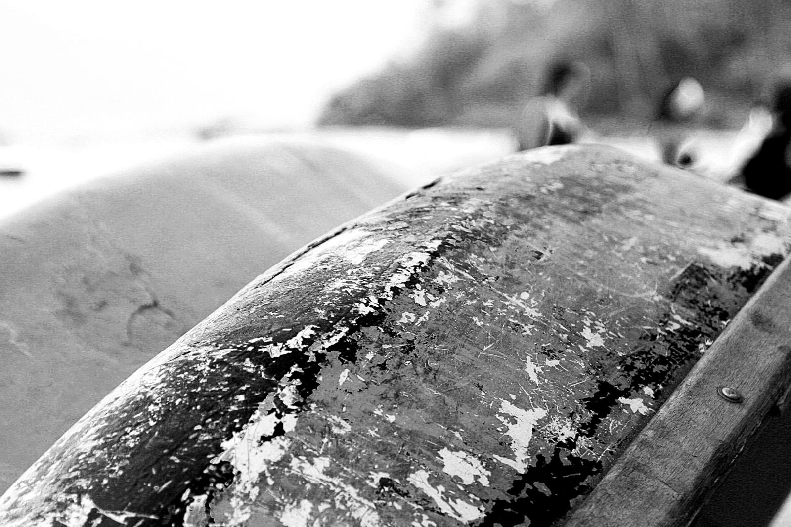
Block: Image
Welcome to image alignment! If you recognize this post, it is because these are blocks that have been converted from the classic Markup: Image Alignment post. The best way to demonstrate the ebb and flow of the various image positioning options is to nestle them snuggly among an ocean of words. Grab a paddle and let’s get started. Be sure to try it in RTL mode. Left should stay left and right should stay right for both reading directions. On the topic of alignment, it should be noted that users can choose from the options of None, Left, Right, and Center. If the theme has added support for align wide, images…
-
Block: Button
Button blocks are not semantically buttons, but links inside a styled div. If you do not add a link, a link tag without an anchor will be used. Check to make sure that the text wraps correctly when the button has more than one line of text, and when it is extra long. Buttons have three styles: If the theme has a custom color palette, test that background color and text color settings work correctly. Now lets test how buttons display together with large texts. Lorem ipsum dolor sit amet, consectetuer adipiscing elit. Donec mollis. Quisque convallis libero in sapien pharetra tincidunt. Aliquam elit ante, malesuada id, tempor eu, gravida…
-
Block: Gallery
Gallery blocks have two settings: the number of columns, and whether or not images should be cropped. The default number of columns is three, and the maximum number of columns is eight. Below is a three column gallery at full width, with cropped images. Some more text for taking up space. A two column gallery, aligned to the left, linked to media file. In the editor, the image captions can be edited directly by clicking on the text. If the number of images cannot be divided into the number of columns you have selected, the default is to have the last image(s) automatically stretch to the width of your gallery.…
Ezeket is érdemes megnézni
WP 6.1 Theme block category
-
Block: Columns
This page tests how the theme displays the columns block. The first block tests a two column block with paragraphs. This is the second column. It should align next to the first column. Reduce the browser window width to test the responsiveness. This is the second column block. It has 3 columns. Paragraph 2 is in the middle. Paragraph 3 is in the last column. The third column block has 4 columns. Make sure that all the text is visible and that it is not cut off. Now the columns are getting narrower. The margins between the columns should be wide enough, so that the content of the columns does…
-
Block: Quote
The quote block has two styles, regular: Gutenberg is more than an editor. The Gutenberg Team and large: Yes, it is a press, certainly, but a press from which shall flow in inexhaustible streams, the most abundant and most marvelous liquor that has ever flowed to relieve the thirst of men! Johannes Gutenberg The quote blocks themselves have no alignments but the text can be aligned, bold, italic, and linked: Right Theme Review In addition to the quote block, we also have the pull quote, with a regular and a solid color style. You can change the color of the border and the text with the regular style: In addition to…
-
Block category: Common
The Common category includes the following blocks: Paragraph, image, headings, list, gallery, quote, audio, cover, video. The paragraph block is the default block type. It should not have any alignment of any kind. It should just flow like you would normally expect. Nothing fancy. Just straight up text, free flowing, with love. This paragraph is left aligned. This italic paragraph is right aligned. Neither of these paragraphs care about politics, but this one is bold, medium sized and has a drop cap. This paragraph is centered. This paragraph prefers Jazz over Justin Timberlake. It also uses the small font size. This paragraph has something important to say: It has a…
-
Block category: Embeds
This post tests various embed blocks:
-
Block category: Widgets
The shortcode widget: The Archive Widget: The same Archive widget but as a dropdown: The Category widget block has an additional option for showing category hierarchies: The Latest Comments widget can display or hide the avatars, the date, and the comment excerpt: Here is an example of the Comments widget with all the options disabled. The number of comments has been reduced to two. And here is the Latest Posts widget in the list view, with dates: Grid view, now sorted from A -Z. You can also change the number of columns used to display the latest posts. The block below only displays posts from the Block category: Search widget:…
-
Block category: Layout Elements
The Layout Elements category includes the following blocks: Group, Button, Columns, Media & Text, separator, spacer, read more, and page break. This group block has a light green background color. The read more block should be right below this text, but only on list pages of themes that show the full content. It won’t show on the single page or on themes showing excerpts.
-
Block category: Formatting
The formatting category includes the following blocks: The classic block can have almost anything in it. a heading The custom HTML block lets you put HTML that isn’t configured like blocks in it. (this div has a width of 45%) The preformatted block.The Road Not TakenRobert Frost Two roads diverged in a yellow wood,And sorry I could not travel both (\_/) And be one traveler, long I stood (='.'=) And looked down one as far as I could (")_(") To where it bent in the undergrowth; Then took the other, as just as fair, And having perhaps the better claim, |\_/| Because it was grassy and wanted wear; / @…